Saturday, 31 August 2013

180 degree rule & shot reverse shot

The 180 degree rule
In class we have been studying different camera angles, and I will be focusing on the 180 degree rule in this post.
In film making, the 180-degree rule is a basic guideline regarding the on-screen spatial relationship between a character and another character or object within a scene.
This rule states that the camera should stay on one side off the imaginary line. This ensures continuity between shots.

If you break the rule in over-the-shoulder shots, it can seem as if the characters are not looking at each other, this can be the case in many Hollywood movies, it is a huge editorial mistake.


This picture shows the relationship of the camera and the 180 degree angle it must keep. The camera can rotate from side to side in the green area and the characters image and positioning will remain the same throughout, where as if the camera were to rotate into the red area the characters position would be opposite and from the wrong angle, so the continuity of the editing would be wrong.


shot reverse shot

Shot reverse shot (or shot/counter-shot) is a camera angle where one character is shown looking at another character (often off-screen), and then the other character is shown looking back at the first character. Since the characters are shown facing in opposite directions, the viewer assumes that they are looking at each other.
The Shot reverse Shot also involves quick cuts and cross editing to work. 


This image is show how the camera is on one characters action / movement, it then shows the second characters action/movement and then refers back to the original characters reaction. This camera angle is used frequently in film and is a good shot to use to portray emotion.


Friday, 30 August 2013

Match on Action

Match on Action

Match on action (also known as cutting on action) is an editing technique for continuity editing, one shot cuts to another shot portraying the action from the subject in the first shot.
This creates the flow of continuity, the action being carried through created a 'visual bridge' this draws the viewers attention away from slight cutting or any continuity issues.
Furthermore it portrays a continuous sense of the same action rather than matching two separate things.


I then crested my own match on action scene, i walked through the door into a room and sat on the sofa. the way I made the continuity editing work was by using two cameras to film this quick scene, one on the outside and one inside the room. The cameras were both filming at the same time so the editing would flow.

Wednesday, 28 August 2013

Preliminary Task

Preliminary Task


Below is the script of our preliminary task and the video we have created of our preliminary task.

Script: 
(Story: A young girl walks into a classroom and sits down, she spots a young man that she instantly feels attracted to and begins to make awkward conversation with him...)

Girl: (walks into the room, sits down and glances at the boy) : Hi!
Boy: (looking up from book) : Err... Hello.
Girl: (apprehensively) : I don't know about you but I haven't got a clue what to do for Miss.Jones maths homework... do you?
Boy: NO! I don't... maybe we can work o it together?
Girl:Yeah, okay that sounds great... who's place? yours or mine?
Boy: Umm... maybe here, right now... in the library?
Girl: Ohh yeah of course... um... lets get to work
boy: Okay question one... 243 X 6...
Girl: Umm... if I knew the answer I wouldn't be asking you for help would I?

Preliminary task video


This preliminary task it beneficial to our progression in this work as it provides us with something to expand a learn from. The preliminary task also helps us as it is like a practice run with using the cameras, editing etc. We practice different camera angles and shots as well as many different editing techniques, the new techniques we learn will benefit our final production. This task was completed in school.

Evaluation of preliminary task

Evaluation

Our Evaluation of the preliminary task.
Mary Thompson & Leah Gathergood

Below I have embedded a video from YouTube of our evaluation we made a video insert of us talking about how we can and have evaluated our preliminary task and what we can do to improve our work. It also provides us with the skill to self assess our own work, progress and improvement which will be beneficial when it comes to creating the final product.


Tuesday, 27 August 2013

Horror film survey and evaluation

Horror Film Survey

The link below contains the horror film survey evaluation conducted by our group for research purposes for our film production. The website use is survey monkey and we asked individuals to complete the questionnaire and from the answers found we have submitted an evaluation.

http://www.surveymonkey.com/s/JC89MGF

Evaluation

The results of our horror film survey showed a diverse range of answers we analysed them and decided exactly what we need to incorporate into our horror movie.


Our results showed that our main age range for our target audience is 17 - 19 year olds so we will make out film a 15 age rating.

Below is a series of images that represent our evaluation.
Created by Mary Thompson on imgur.com


Monday, 26 August 2013

Horror Research

Horror Research

I have been conducting independent research on Horror movies for my AS media filming projects. Below is some of the research I have studied.


This horror research is contributing to my horror work as I am learning proficient codes and conventions in what to add to my work and how it need to conform with the horror genre.
We will use aspects of the iconography we have researched as they are typical of horror films and we will also relate and conform to two different horror films we that we will base our film around 'The eye' and 'The unborn'.

Here is a clip of the film 'The eye' featuring hallucinations and death.


Leah conducted research into age ratings and some iconography.

Websites I used for research and pictures for horror iconography 
http://rachaelmariebreheny.wordpress.com/2011/01/24/iconography-of-a-horror-film/


costume research

Conventional costume research in horror films

Here I have created a collage on imgur of some of the conventional costume worn in horror movies.
I have also used pictures from the films 'The unborn' and 'The eye' as we will follow conventions off this dress code in our horror film.
Created By Mary Thompson on www.imgur.com


Conventional horror costume:
  • Dresses (long, dark) 
  • Casual (t-shirt and jeans etc.
  • Black hair
  • Blood stained clothes
  • masks or face covers

Sunday, 25 August 2013

Film pitch and padlet response

Film pitch

Below is our Film Pitch idea for our horror film opening after conducting research we have produced this idea.

Title: Sick Mind

Sick mind is inspired by films 'The eye' and 'Unborn'. Its about several women who are suffering from a mental disorder that they inherited from there ancestors of Nazi experiments, one woman foresees the mental problem and seeks answers and a cure. Little does she know... there is only one thing she can do.

Our film follows basic conventions of the horror genre, the film is based in dark creepy woods which is surrounded by murky water its a mixture of paranormal and physiological demonetisation
Our audience survey suggested that a psychological thriller was more appealing and had the most scary impact so we have made the basis on this production on that.
We are focusing on handheld camera movements and quick cut shots to build an intense and fast scene.The indication that this is a psychological horror and there is a clear mentally ill person will be shown through screaming and fitting of the character.
Our films begins with a small title sequence introducing the producers and directors of the film. (Mary and Leah productions)

The scene begins rapidly with a young woman running through the woods screaming and going physiologically insane, there are a number of quick cuts and fast panning movements, there will be a disorientation effect added on in the editing process to make the scene seem blurry and wobbly.
The woman will fall to the floor in traditional horror film style and begin to go insane as her body bends and breaks. she lets out a huge screams.
The woman begins to cough and then it is clear that she is dead, it is clear that it is a mystery how she died as the camera pans away, the title of the film appears suddenly in white and black writing.

The film would continues as a physiological mystery as this death happens to several other people. There is the one woman who sees the danger and realises she is next, she tries to unravel the problem and break the chain by looking through history books and meeting the sufferers and their families  There turns out to be a correlation as to why the women are suffering from this, they all have a degenerative link to the psychological problem dating back to the world wars in the early 18th century's from experiment conducted on her bloodline by the Nazis.

The woman finds the answers through discovery and chance she is shocked at the out come and try's to delay and find an alternative to what she has to do but only killing herself and her first born child is the one and only gruesome solution. She cannot let the demon psychological problem kill her otherwise the chain will proceed to carry on and affect others life's including her daughter.

Resources needed:
  • Two digital cameras
  • One tripod
  • USB wires
  • Memory cards
  • Costume (Ripped and dirty clothing)
locations:
  • Scary looking woods
Characters:
  • Sarah (mentally sick lady)


This Padlet response is used for constructive feedback on work in progress. The results give in this response will be analysed carefully and some will be added into our final product to make it better and relate to a more diverse target audience. This is great for feedback from the target audience as it give clear and constructive advice on our production.
It can also be commented on by almost everyone, so everyone can have a say and help us to improve the work.
We will be adding final changes to the film pitch on advice we have received and make the product more representative of our target audience and there requests.

Saturday, 24 August 2013

Storyboard and shot list of Horror Movie

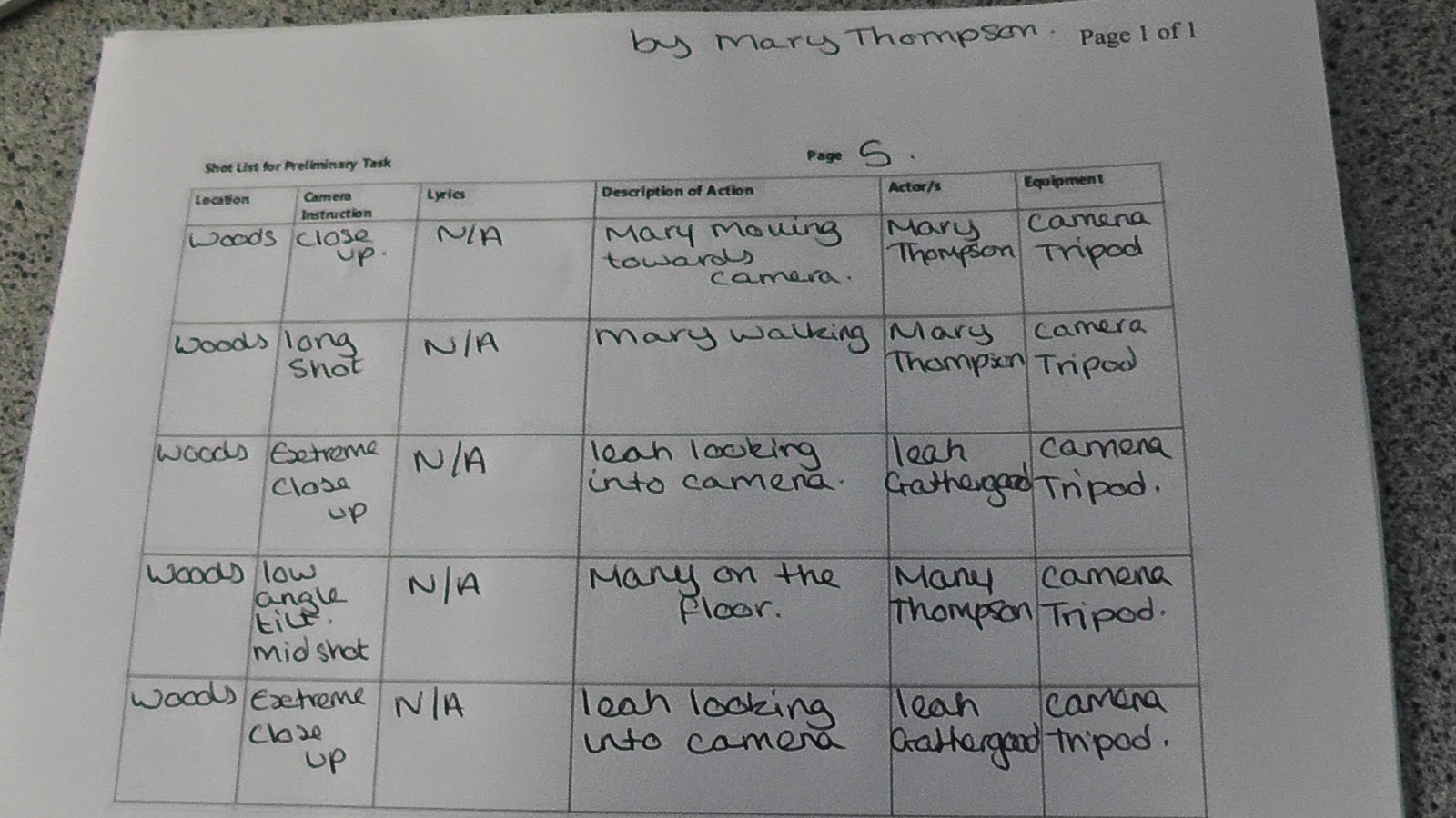
Shot list

Below I have added the shot list to our horror film it is in step by step order. A shot list is used to help us structure and keep all of our work in order.


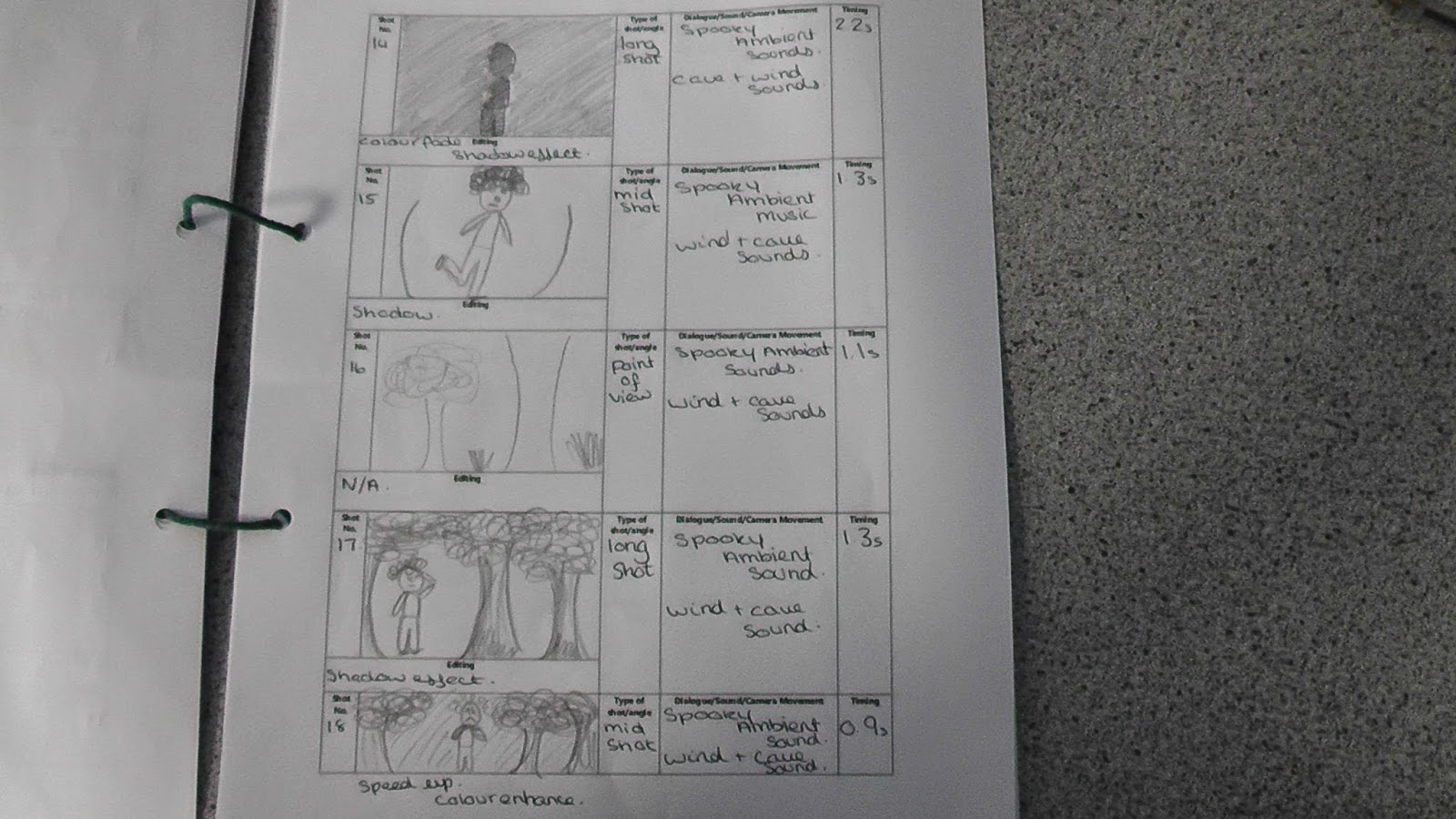
Storyboard
Below I have inserted pictures of our storyboard. The use of a story board is essential in this horror filming project as it gives us clear guidelines on what we need to when, where and the action involved. Its also beneficial in the editing process as it shows us what we wanted to add to the edit.


Friday, 23 August 2013

Location Shots

Bentley priory photos

Below is a list of shot of the location we will be filming our Horror film opening at.

This priory will be the shooting location of out horror movie. This location is perfect for our horror movie as the opening sequence begins with a woman runny through a forest and falling on the ground. They relate with our horror genre as scary and deserted woods are conventional of horror films. 
There is a huge amount of space available to use and great looking locations.
One uncertainty would be the weather if its raining filming may be very difficult or might not happen at all.

This location would be great for shooting long shots and panning shots not only to capture the action but the scenery.


This location would be perfect for the section where our main character falls on the floor and goes insane. Its a creepy looking location surrounded by tress to give it a dark and hidden feel.


Monday, 19 August 2013

Indents and research

Indents and research


This is a snap shot of an ident this one if for columbia records

Ident - This is short for identification (in informal / technical use). in relation to the film industry is is a short (usually animated sequence shown at the beginning of the film (trailer/advert) to identify the film production company who created the film.

Idents can be creatively altered to match the genre of the film for example lions gate, lions gate produce many different types of ident to relate to the genre of film for example in a horror film the indent will conform to horror conventions with scary music or links to blood and gore etc this helps build suspense before the film has started and is also a unique outlet for the company.


The design of this indent is based around a Sci-fi theme this denotes that the film ahead could be of the sci-fi genre foreshadowing the films narrative. The audience are greeted by a grand visual effects and appear to be flying backwards through the universe as galaxies stars and planets pass them. There are some clouds and bright glistening sunlight, then appears the lions gate logo accompanied by some grand orchestral (trumpet) music which fades out to a stop.
This indent has been created to advertise the company who funded and created this film it can be used to connote the movie ahead with its sic-fi foreshadowing and visuals. 


Influence on my work
After analysing the indents I have looked at I have gained a better understanding of how to include my own indent. The genre we are studying is horror, therefore the indent will be dark and mysterious looking. I didn't want my indent to reflect the horror genre as I though I would stay conventional and keep a classic style indent, so it is kept simple yet conventional and this will create a sense of professionalism and also build suspense. The writing in the indent says 'M&L productions'.

My indent


Sunday, 18 August 2013

Costume

Costume

Below is a list of the costume we will be using in our horror production.

Main Character

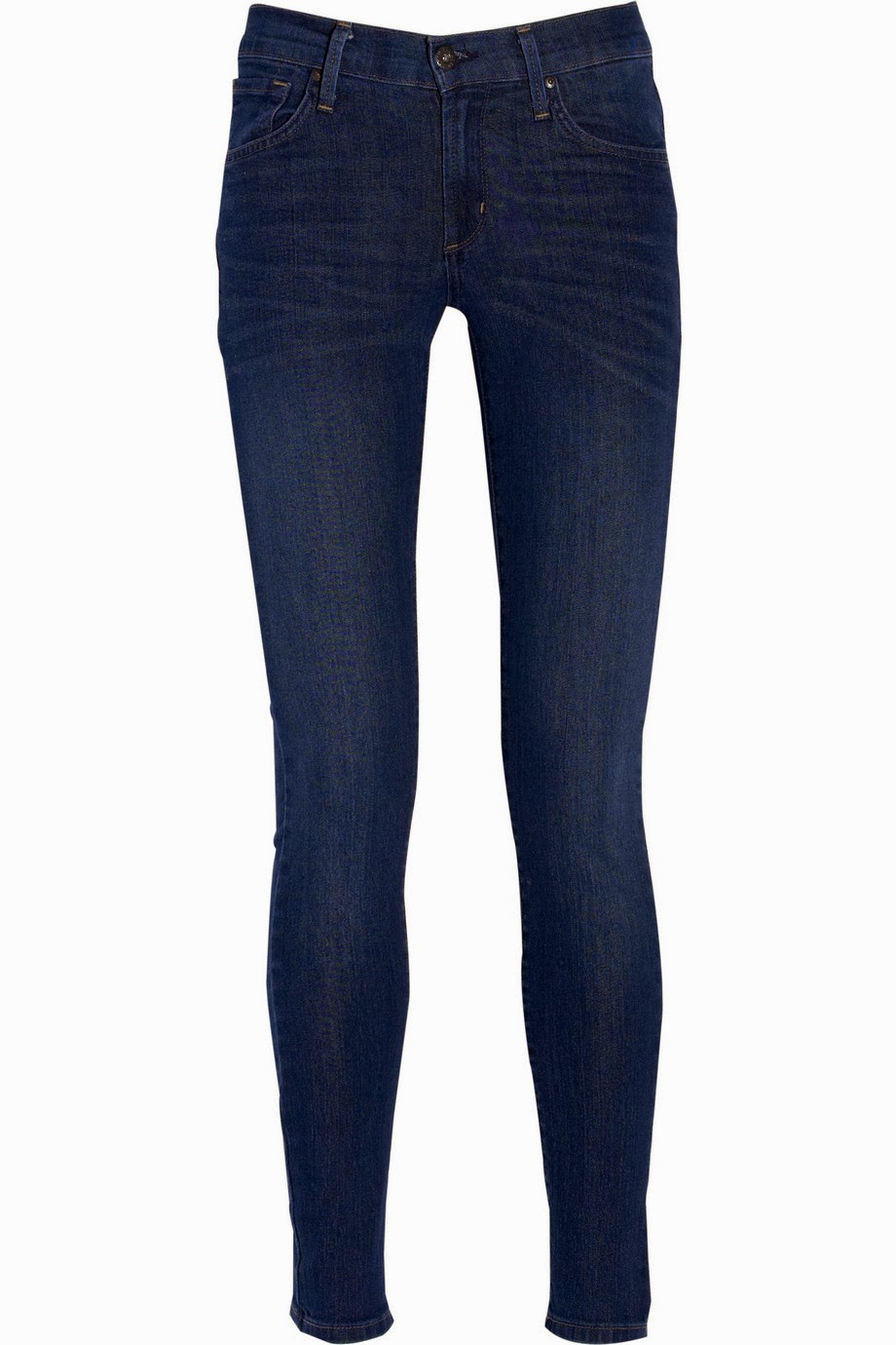
Our main character will be dresses in black wellington boots, a white shirt and black leg gins.
this costume is a casual style the character is connoting a normal woman.


Evil character

The antagonist will be wearing dark jeans and a black hoodie with black shoes this doesn't connote the evil that she is but it connotes what is happening the main character is hallucinating and seeing this demon but the demon is not the stereotypical evil, just a normal woman.


Below is the costume we are wearing in our final production, it closely replicates the images above.
I used www.imgur.com.

Saturday, 17 August 2013

Final Product and Evaluation

Final product

Below I have embedded the final film product, my role in creating this production was acting and editing. Leah Gathergood's role was filming and directing and acting.


Evaluation

Question 1

In what way does your media product use, develop or challenge forms and conventions of real media products?
(Answered by Mary Thompson)

At the beginning of the film the audience is greeted with an establishing shot of the setting in our film.
As the actress runs towards the centre of the shot to create a mid-shot there is a loud non-diegetic sound of a horror scream. From this shot and use of sound it is clear to the audience that something bad is happening and the setting is an abandoned and quiet forest. The  use of the abandoned forest is conventional of horror films and reinforces the horror genres cinematography connotations.This strange and enigma filled film opening creates a feeling of suspense and tension among the audience and also helps set the scene  of the rest of the film to unfold. The dark ambient shadow effect used on the frame of the shots exposes the audience to a dark and sinister feeling. this feeling matches the narrative of the genre and is what we want to portray to the audience.A title font is also shown in this shot in bold white writing it fades in and fades out of the actresses name (Mary Thompson) this follows codes and conventions of films and exposes a real and professional element to the production.
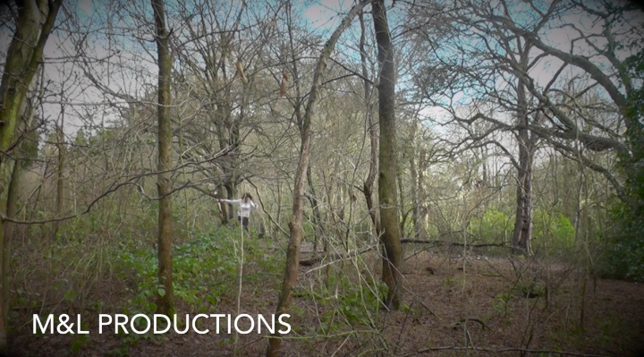


As the character continues to fumble around and the suspense and mystery of what is going on deepens like most conventional horror films the clip appears to flash to another of the character in a different position in a sped up motion. This is used to give the audience a twisted and weird feeling. The shot quickly switches back to the daemon in this film played by Leah Gathergood she appears to appear then disappear as if she is an hallucination this effect develops forms and conventions of real media products as it is a good use of creating a suspense filled film effect that conforms to horror conventions, the effect on the audience is to scare them so the question what is going on exposing the feeling that they are on the edge of their seats.
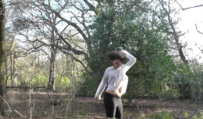


Another convention of the horror genre we have developed is the hallucination of the evil girl she is denoted as dark and sinister looking and appears at different parts of the opening sequence this creates a tense mood among the viewers and follows conventions of horror films as it is dark and scary looking, some of the sped up angles and close up also suggest that this is a hallucination watching Mary in the forest and messing with her head sending her crazy an eerie and dark atmosphere is created.


Some uses of the costume in this film follows the structure of our narrative Mary is wearing legging a white flowing shirt and wellington boots, this out fit follows stereotypical representations of the 'Average woman' in today society. Leah's clothing as the daemon connotes stereotypical dress of ' the average woman' as that is what she is she just turned evil and so effects are added to make that relevant.


Many uses of different types of camera work are denoted in this production such as shot reverse shot and quick fast paced edits and cuts. This contributes to the stereotypical horror representation as created a feeling of suspense among the audience and attempts to push the audience to the edge of their seats.

As the opening sequence progresses the story begins to become more confusing and more creepy. The character is seen thrashing around and going 'mad' , leaving there viewers questioning what is going to happen next, the enigma code is represented throughout the whole opening sequence. This use of a technical code sets the story and suggests that there is some psychological trauma that has happened for this to become apparent. To keep the sequence conventional we decide to keep the fast paced edits and dark ambient music for the non-diegetic sounds. Similar to films such as 'Unborn' (David S Goyer) the character story is creating the main body of the film, we have reference in our film some hallucination scenes featured in the film 'The eye' (David Moreau) This helps us keep to conventions and relate to films of the same style.


Lastly we have added the titles of the sequence at the end of the opening sequence. we decided that the main titles would look more conventional to the horror genre if they appeared after a short opening sequence we used this effect as it has a dramatic and cliff hanger feel for the audience. We chose the title 'Sick Mind' because it relates to the synopsis of the film, the title also reflects the horror genre and follow codes and conventions in the way it appears and disappears.

In conclusion the groups opening sequence production appear conventional and stereotypical of the horror genre.

Reference films

Here is a film we are relating to and referencing in our film called ' The eye' this is a hallucination scene.


This is a trailer for the film 'The Unborn' we are referencing this film as it holds connotations we will use.


Question 2 
(Answered by Leah Gathergood)
http://leahmayg.blogspot.co.uk

Evaluation
How does your media product represent particular social groups?

For this question, I have explored how we have represented women in our media product.
I have compared our protagonist to the woman in the horror film 'unborn' 
As shown in the images below, the women have similar costumes. They are dressed casually, however their make up and hair has been done in a way which denotes them as if they are 'crazy'.
Their hair is scruffy, the have make up smudged on their faces and the character from unborn even has blood on her shirt.

In many horror movies, including our media product, women are often represented as a weak character. 
In the screen shots below both the woman seem to be breaking down suggesting they are weak and need help. They're screaming and crying which is conventional of women in horror films.

The third image is another screen shot from our media product. This woman is a hallucination of the main character. She is dressed casually as she is meant to be a normal woman in the main characters mind, however, the protagonist imagines her as evil, which is why we changed the effects when this woman appeared on screen. 
This is challenging the stereotypes of women in horror films as she is not seen as a weak woman, she is represented as someone who seems to have power and who may be evil, although it is all in the protagonists mind. 


A screenshot from our media product. 


A screenshot from the horror film Unborn.


Question 3

What kind of media institution might distribute your product and why?
(Answered by Mary Thompson)

below I have used the website www.bubbl.us to create a mini mind map of the type of companies that would distribute our production.


Here is a website containing a collage of images which relate to our products distribution. The images are a mixture of our media production 'Sick mind' and the film 'The Eye' which has influenced our choices and work in producing this opening.

http://marythompson007.imgur.com/all/


Question 4

Who would be the audience for your media product?
(Answered by Mary Thompson)

The target audience we have pitched our horror production at young people aged between 15 and 19 years old (older audience's are welcome to view).
We came to this decision about our target audience from external research into out horror films and who there target distribution audience are. Our research found that the mass market was young people age between 15 and 20 along with older adults who were a niche market, after evaluating our results we found that the younger audience was more appropriate to base our production on so we adapted our production to suit the codes and expectations of a younger mass audience.

We did this by using young actresses in a common and relatable setting. We did this because the audience would feel a sense of familiarity to the actors and begin to retrieve doe audience pleasures from the production such as familiarity and conformity.
We conformed with stereotypical codes and conventions that would be found in a teenage base horror films such as trendy clothing, and clean appearance. We also related to teenagers are they would appear scared and frightened if they were alone in a big scary Forrest so we captured that with the acting skills used. From researching our target audience we found that we have created a film opening that our target audience can relate to and enjoy watching.

Below i have embedded a series of photos of who our target audience would be using www.photosnack.com.

http://www.photosnack.com/marythompson007/pdn34njj


Question 5


How did you attract/address your audience?
(Answered by Mary Thompson)

After researching our target audience and find typical codes and conventions they would follow we looked into finding different conventions audiences would like and feel that they can relate to.
we used short interviews to find out what audience of our age would like, this has helped us to see what are audience would like and things they could relate to in order for them to enjoy the film, This gave us a good idea of what to add into our production.

Here is a YouTube video showing people our age being interviewed typical conventions of horror movies.


Here is a slide show of some conventions I created using www.phototsnack.com
http://www.photosnack.com/my-slideshows/details/ptu92kpp?jsalbum=1


Question 6
What have you learnt about technologies from the process of constructing this project? (Answered by Mary Thompson)

During the creation and editing process of our horror production our skill and knowledge has improved profoundly. Our newly heightened intellect on various technologies and media platforms has led us to create a final production.
We used many different media technologies such as IMovie and ITunes we have broadened our knowledge of the use of there media platforms and used them proficiently and properly. Furthermore we used IMovie to create the indent this was a fairly straight forward task.

Whilst researching for our production we found many different media media platforms available to present our ideas and work some websites we found were survey monkey, prezzie, photo snack, imgur,bubbl, youtube, slid share we used theses platforms to express our findings and knowledge on different aspects of our research. Theses platforms were straightforward to access and use they were easy to embed and flowed well on the blog.

Below is a PowerPoint presentation of the technologies we used in our production i used slid share to upload this to my blog.

http://www.slideshare.net/marydude/technologies-of-media-platforms


Question 7

looking back at your preliminary task , what do you feel you have learnt in the progression from it to the full product?
(Answered by Mary Thompson)

After looking back at the preliminary task, there has been a lot learnt from that starting process to the final product. In terms of camera movement, cinematography and editing we developed our editing skill on IMovie to an extensive knowledge on how to use the programme proficiently this gave us much more technicality to add to the final production as we experiment more with IMovie we found it easier to use for example using transitions, titles and speed editing.
Our camera angles have become more complex swell as more of a variety of shots such as long shots, mid shots and close ups.
Cinematography has been improved by having a more relative location , costume and make up.
our preliminary task and final production are shown below the differences in improvement are profound.

Here is our preliminary task production This was uploaded using Youtube
https://www.youtube.com/watch?v=FOM-L0zIspI


Here is our final production this was uploaded using Youtube
https://www.youtube.com/watch?v=GqN2PQ7tJBE


Below is a slide show I have created using animoto it contains a list of the shots we have used in our final production.
 http://animoto.com/play/xuuPhjw1QRV0mv1pxtGkBQ


Camera shots


Images of our production

Images of our production in the making

Below I have embedded some images from our production during the creation of the final production.